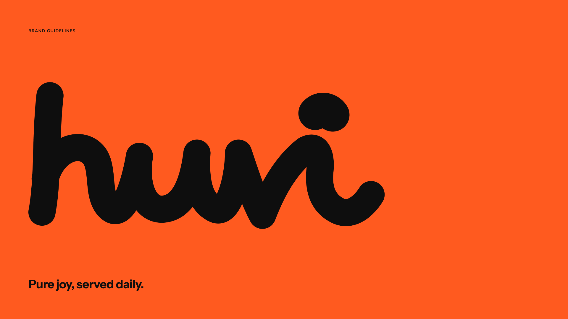
Huvi: pure joy, served daily.
Identity for a new dog food brand: a one-line logo, black and white with one loud orange, packaging and imagery rules.
Client
Huvi
Service
Branding
Year
2026
Deliverables
Logo and symbol, color, typography, packaging, imagery, brand guidelines
Context
The idea
Huvi is Finnish for joy. The brand had to feel simple, warm and a little playful: confident on a shelf, calm on a screen.
What we did
01 Logo
One line, drawn without lifting the pen. Simple, warm and a little playful, with a symbol that works as an app icon.
02 Color
Mostly black and white, with one loud orange. Four tested pairings for packaging and screens.
03 Typography
Instrument Sans for headlines, so the logo can be the playful one, and a friendly rounded face for everything else.
04 Imagery
Dogs with their people, in motion. Real moments and natural light, never a posed portrait on a plain backdrop.
Outcome
Outcome to confirm.