Kamikiri: ink, vermilion and rice paper.
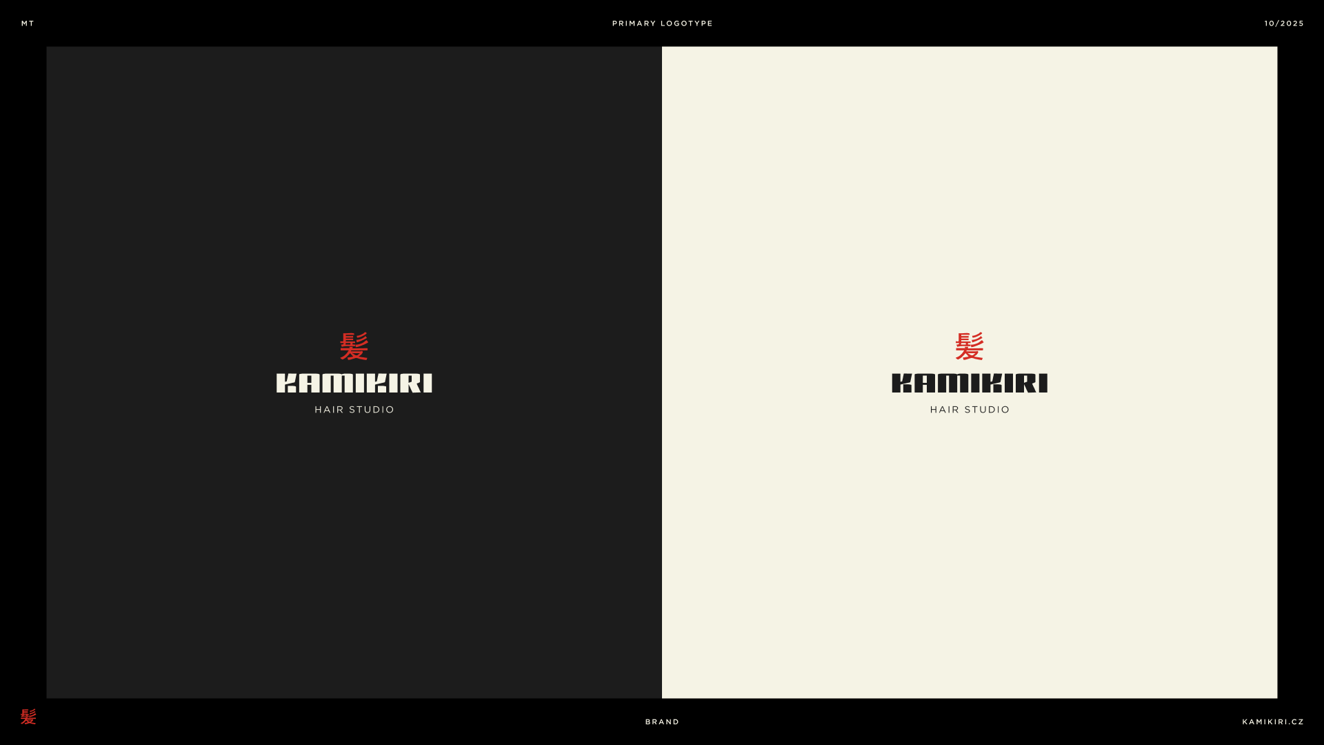
Brand exploration for a hair studio: logotypes with a Japanese and a European symbol, and a palette drawn from traditional materials.
Client
Kamikiri
Service
Branding
Year
2025
Deliverables
Logotype variants, symbol, color palette
Context
The brief
Kamikiri is a hair studio with Japanese roots. The exploration looked for a mark that feels crafted and calm, not themed.
What we did
01 Logotype
A primary logotype, Japanese and European symbol versions, and a text-only logotype.
02 Color
Shu vermilion for energy, sumi ink black for craft and washi off-white for warmth: a trio built on contrast and balance.
Outcome
Outcome to confirm.