Rivelo: invoices, paid on time.
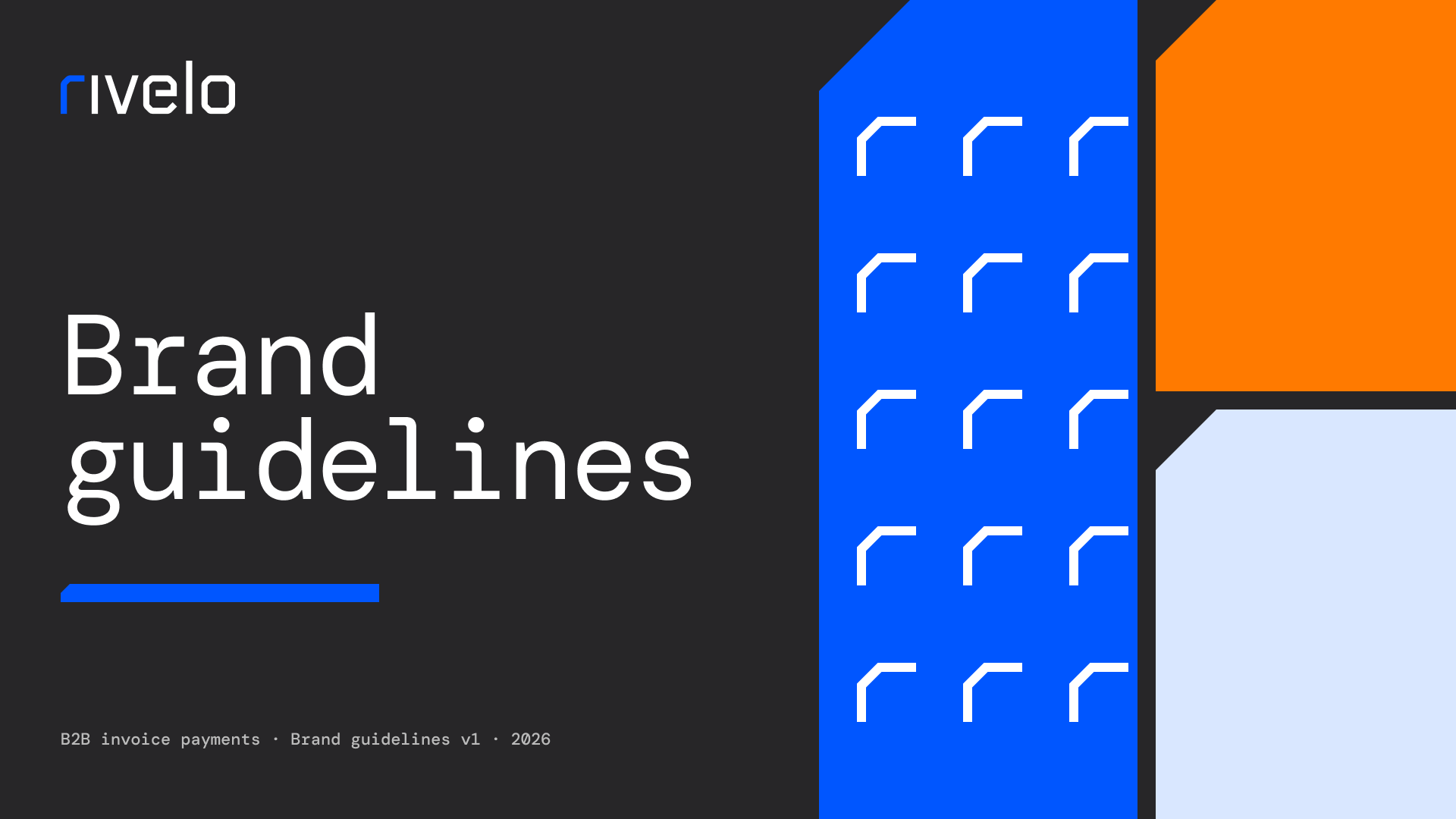
Brand guidelines for a B2B invoice payments platform: monospace headlines, one blue with an orange accent and a 45° chamfered corner.
Client
Rivelo
Service
Branding
Year
2026
Deliverables
Logo and symbol, color, status colors, typography, UI graphics, app icon
Context
The brief
Rivelo lets companies send, track and pay invoices without spreadsheets or email threads. The brand had to read as precise and trustworthy in a product full of numbers.
What we did
01 Logo
A logotype with a distinctive r, a symbol for the app icon and favicon sizes down to 16 px.
02 Color
One blue, an orange accent, a gray ramp and status colors for paid, due and overdue.
03 Typography
DM Mono for headlines and numbers, Inter for interface text, Foundry Gridnik for buttons and labels.
04 Graphics
The 45° chamfered corner carries from the logo into cards, charts and UI.
Outcome
Outcome to confirm.